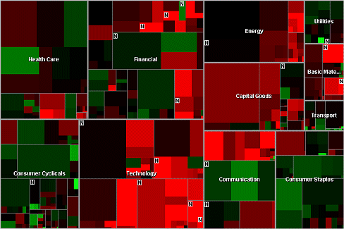
Understanding the daily fluctuations in the stock market is a serious business for traders, analysts and investors. There is money to be made in those fluctuations and the Map of the Market is one of the best visualization tools around: it can show the changing stock prices of over 500 publicly-traded companies on a single screen. Since its launch by SmartMoney.com at the end of 1998, the Map of the Market has become a firm favourite with users. This is due, in large part, to the fact that it presents large volumes of fast changing data in a very useful and usable format, providing people with answers to the basic question 'how is the market doing today?' at a single glance. It is probably the most useful exemplar of information mapping on the Web today and is well worth trying out if you've never used it. On one single map one can quickly gain a sense of the overall market conditions, yet still see many hundreds of individual data elements.