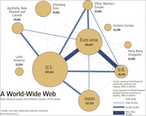
Some really nice infoporn over at The Big Picture right now. The linked chart compares the assets of various nations organized into geopolitical buckets.
Notice that Asia, for all its mindshare, is still relatively tiny, and the U.S., despite her plethora of self-inflicted woes, remains globally dominant.
In other words, America can screw up an aweful lot for a long time before international competitors are really a threat to her economic position. (Although a commenter in the thread observes that U.S. asset prices may be unfairly high due to foreign currencies being pegged to the dollar.) Also worth a look is this chart which vaugely compares the GDP of various nations with various U.S. States. I'm sure you're heard before that California has roughly the GDP of France (and half the population) but I didn't know that Texas has a comparable GDP to Canada. And Georgia, oh Georgia, if only your ski slopes were as nice as your GDP...
Its worth comparing top lists for GDP between 1995 and 2005. There have been some significant changes. For example, Canada appears to be falling behind in international terms, although I don't know if that is due to failings on her part, or simply that far more populous countries are starting to get their acts together. Brazil is rocketing up, but they have 6 times the population of Canada. Canada's population is comparable to California, but it is spread out over a far wider area, which probably makes it less efficient. (I also think that weather plays a role. Snow plows cost money.)
As various countries begin to figure out how to operate effective economies and stable politics you'd think that these charts would normalize toward a reflection of population differences, with some effects due to geographic constraints such as those I mentioned for Canada. Of course, I'm describing a vision for world peace. I think we're a long way off, but it appears progress is being made.
A longer term investment in ETFs targetting countries that have moved significantly between 1995 and 2005 might be a very sound idea if coupled with a reasonable understanding of and monitoring of the political and economic stability of the countries in question. Of course, I'm not an economist, so take that with a grain of salt.